The Four Worst Sites For SXSW Coverage.
 March 19, 2010 at 5:11 PM

For the most part, music festivals typically yield mediocre reviews at best. Hazy recaps, a few blurry photos, and when yours truly happens to be writing it, a whole lot of "wah, it's too hot outside!"
But, with South by Southwest being a veritable haven of up-and-coming blog buzz bands, we've been sitting back in Brooklyn, waiting for word to be spread about new bands to check out and fresh tunes to listen to instead of the same ol' nonsense reviews. And, while some have given us a great glimpse into what's going on in the South, others, well...let's just say they fall pretty short:
Huffington Post. Hiring an artist to convey what the fest is like from a musician's point of view might have been a good choice, but picking one that performs French ballads (a completely unaccessible genre) and is absolutely awful at writing wasn't. With Marianne Dissard's 700 words of complaint about how much money she's losing from performing and even admitting in her column that getting to write for HuffPo was a last-minute fluke, it's a missed opportunity, on both behalfs.
Filter. There's only one update and only four photos of their own freaking showcase. Total and complete fail.
Pop Tarts Suck Toasted: Pop Tarts is one of my favorites, and to go without for a few days because of a forgotten camera cord is a total bummer. Someone get him replacement, quick! We can't wait to see what he's seeing, especially since we'll be refreshing the page constantly once he gets home.
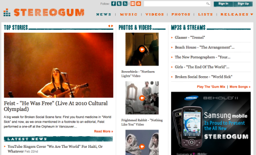
Stereogum: There are three people from the site in Austin, and there are only two photo galleries and a mini-review up on the site. Granted, if they're out having a ball and getting wasted on a mix of BBQ ribs and beer then hey, more power to them, but something more than throwing it to each person's Twitter account for updates would have been nice for us stuck with regular grub and non-sponsored booze back in the borough.
//
oh, thanks:
photo via Spin
 Donald |
  Post a Comment |
  Filter,
  Huffington Post,
  Pop Tarts Suck Toasted,
  SXSW,
SXSW,  Stereogum


